Baggywrinkles Now LIVE on Kickstarter!

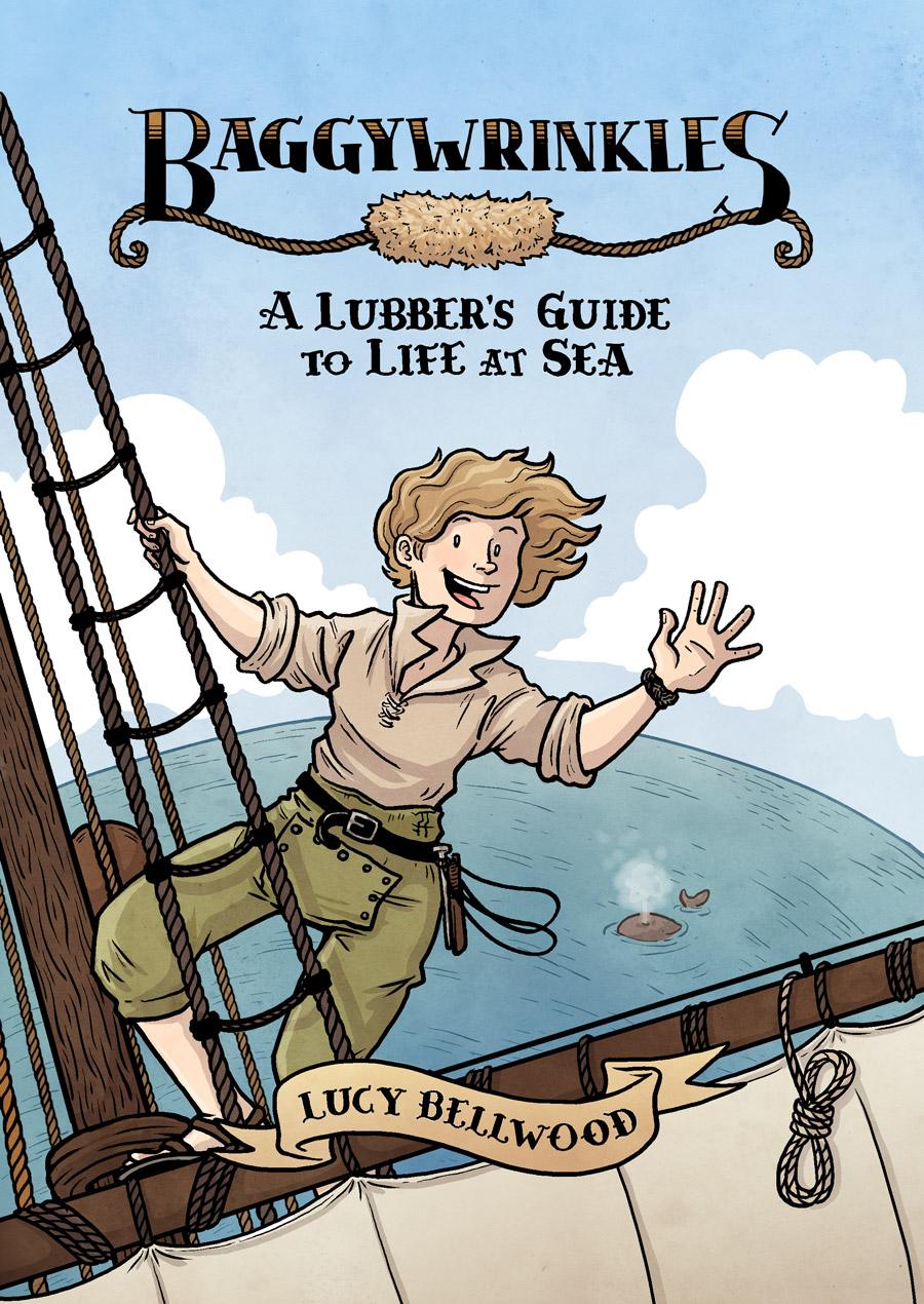
The day is finally here, friends! Baggywrinkles: A Lubber’s Guide to Life at Sea just launched on Kickstarter and it’s time to get this sucker made. If you’re already on board and you wanna get straight to the business, here’s the page!

CoverWeb

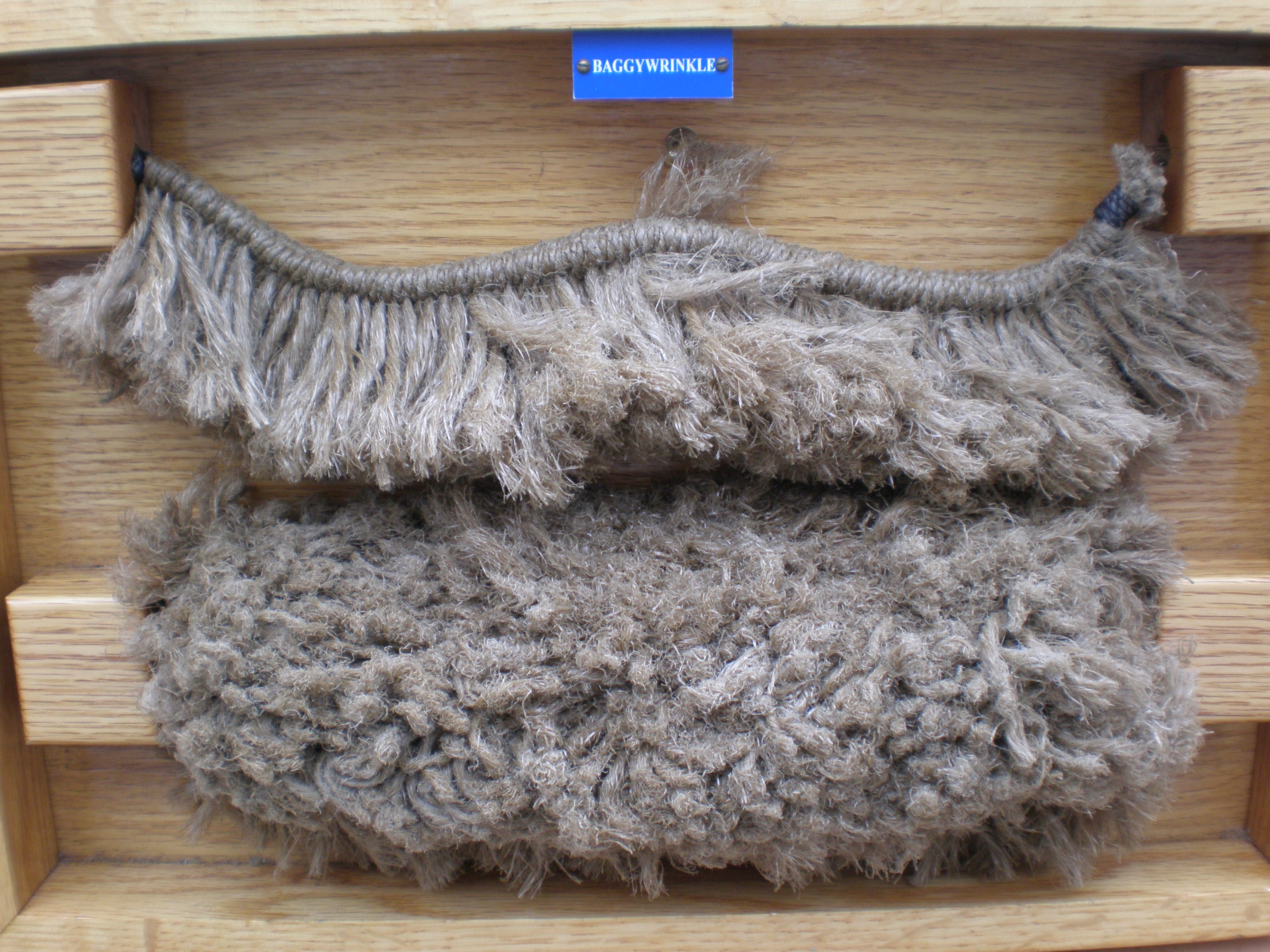
Wait, what’s a Baggywrinkle?

A Baggywrinkle is furry, cylindrical device used for preventing chafing between a ship’s sails and the surrounding lines. It’s one of the most distinctive features of a ship’s rigging, made all the more ludicrous by the fact that you spend a LOT of time explaining what it is to visitors—a hard sell when it’s got such a weird name.

OLYMPUS DIGITAL CAMERA

But it’s also the namesake of my educational, autobiographical series about the time I’ve spent sailing on 18th-century tall ships!

So, you’re making a book?

THAT’S RIGHT. Baggywrinkles has been running in little micro-installments for five years now. With 90 pages of content under my belt I’ve finally got enough material to bind everything together into a really handsome 6″x9″ softcover collection.

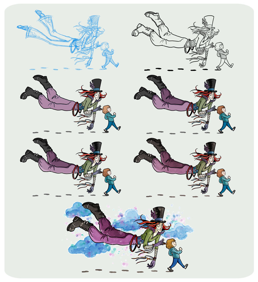
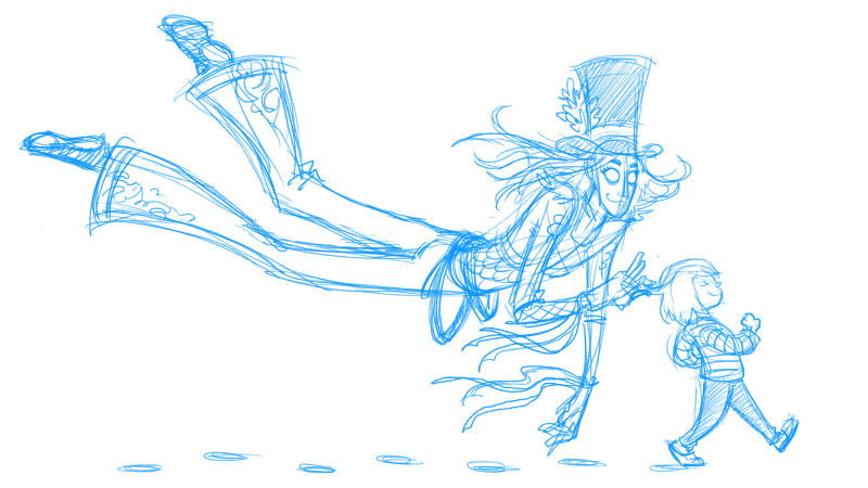
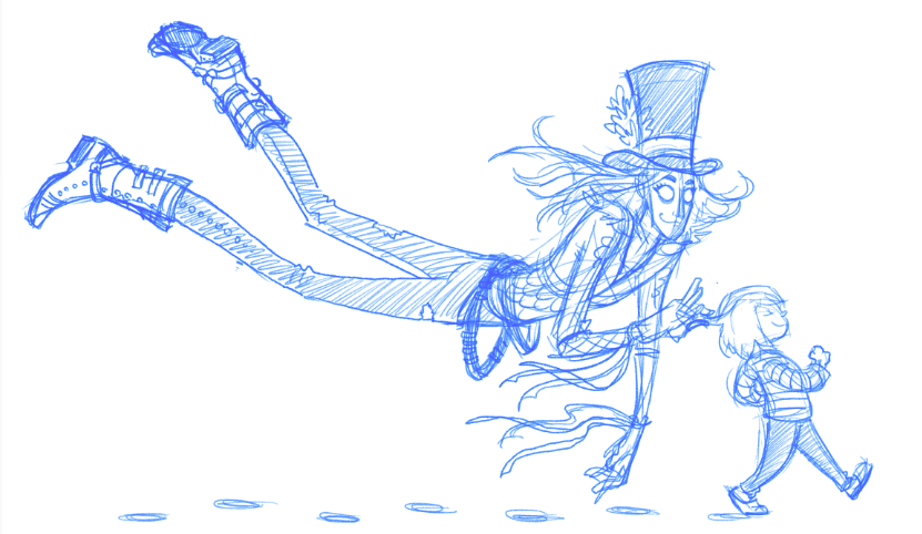
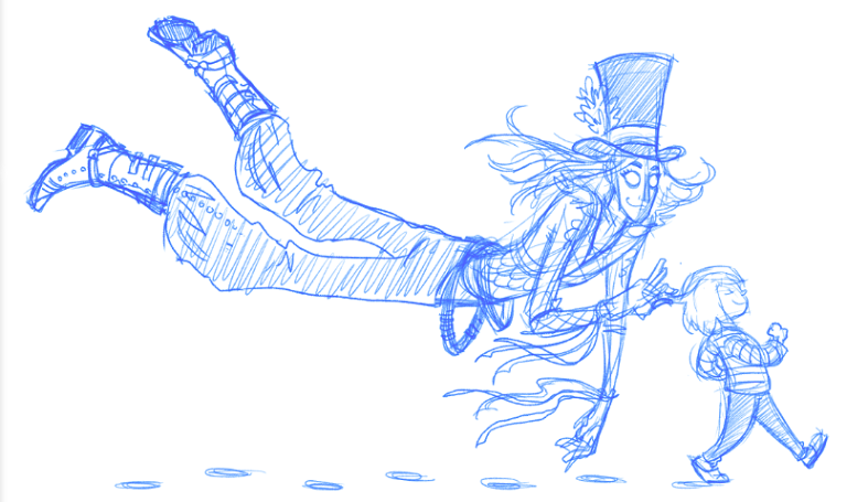
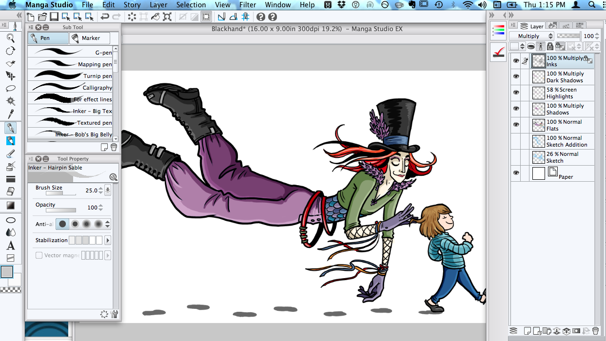
I’m funding this book on Kickstarter because it allows for some really thrilling opportunities to do this collection right. You can check out the campaign page for full details, but the most important thing I want to tell you about is that if we exceed our funding goal of 15k by just $5,000 I’m going to hire Joey Weiser and Michele Chidester to render the entire collection IN COLOR.

ColorCompareSMALLER

I cannot express with words how excited I am about this possibility. LOOK AT THESE LOVELY COLORS! THE BOOK WOULD BE SO AMAZING! I mean, it’s gonna be great either way, but I’m really gunning for color.

So go check out the page and take a look through all the rewards. There’s lots to enjoy—prints, original art, special PDF bundles, and more. And thank you for being such stalwart readers and supporters. You all mean the world to me.

FOR BAGGYWRINKLES. FOR GLORY.

Process Post: Black Hand

A couple months ago I was delighted to receive an email from Glenn Fleishman, who some of you might remember as the fella who interviewed me for The New Disruptors earlier this year, asking if I wanted to work on an article about an imaginary friend for his publication The Magazine.

I love the idea of imaginary friends, even if I never had one of my own as a child, and as soon as I received the list of this friend’s characteristics from writer Lisa Schmeiser I knew this was going to be a lot of fun. You should really just go ahead and read her essay, which does a far better job of explaining Black Hand than I ever could.

But since this is a blog about my creative stuff I thought you guys might like to see a little step-by-step process of the creation of this piece. The graphic below was created for one of my weekly Patreon Process Posts, which I put up every Friday with updates on my current projects and behind-the-scenes info on how I get stuff done. If you dig it, why not subscribe? It only costs $2 a month, and helps ensure the creation of bigger, better comics just for you!

Patreon12.8I created this piece start-to-finish in Manga Studio 5EX. You can see my initial sketch with the pencil tool, which actually went through three versions. First I’d given Black Hand these loopy bellbottoms, but Glenn asked for something a little more like Morpheus from Sandman, so I added bulky Goth boots and snugged up the pants—tight jeans or flowy sweats. We ended up going for the latter.

Sketch1Sketch2sketch3

After the sketch was approved I went in with the Hairpin Sable inker and laid down some lines. Glenn wanted a psychedelic, dream-like color scheme, so after blocking in some bright colors with the fill tool I added shadows (on a separate layer set to Multiply) and highlights (on a separate layer set to Screen) before going in with a watercolor brush and adding splotches and clouds on the background.

Screen Shot 2014-12-18 at 1.15.30 PM

And there you have it! Again, you can read the whole finished article here, and tune in for more weekly process posts like this one over on Patreon.


Patron Saint: VanCAF Promo Card

VanCAFCardWeb

Had a lot of fun illustrating this exclusive postcard for the Vancouver Comic Arts Festival last week. It’s funny how certain pieces really showcase the concept that “Everything’s a Remix”. There are a couple influences here that I’d feel remiss not pointing out: the concept for this piece is totally a spin on a shoot my photographer friend Peter Chee did a couple years ago. His original subject, my pal Tess Myers, is a metalworker, so the halo featured all her tools. I loved that photo and have always wanted to do something similar for illustration or comics.

The second influence is definitely Erika Moen’s saintly portraits, though they have the benefit of real gold leaf (shiny!). I love Erika’s comics, but I’ve also been really inspired by her mixed media collage illustrations. I have all this fancy paper at home that I never really play around with anymore (I used to be more of a book arts gal), so this was an excuse to try something a little more illustrative.

Anyway, keep an eye out for these at VanCAF 2014! I’ll be exhibiting there in May.

Dance and Destroy!

More poster designs for Barefoot Blues! I don’t think I’ve ever drawn an honest-to-goodness dinosaur before this project. This is, I have realized, inexcusable. Expect more dinosaurs effective immediately. Also: inked this guy with a real brush! I normally use a Pentel Pocket Brush for inking my comics, but I finally screwed up my courage and made the leap to real bristles.

It is, of course, way way way way better. I’ll be grabbing a Series 7 for my next inking binge — which should start sometime next week and last well into April. Phew.

Posters n’ Projects

Hey everyone! Sorry things have been a little quiet around here. I’ve been holding myself to a page-a-day schedule for the past three weeks for my thesis, which is shaping up to be around 30 pages altogether. Really excited to get that posted on here, but until I make it that far I’ll be posting oddball illustrations and strips to keep you entertained.

First up is a poster I recently designed for the Portland Underground Exchange — a dance event put on by the awesome folks at Barefoot Blues! If you’re local and interested in spending an incredible weekend with the best dancers and live acts in the Pacific Northwest, I recommend that you check it out. The theme I was given to work with was “dancing trees”, which is quite literally what you see below.

This was my first foray into digital coloring and I felt like a big flaily clumsy baby about it, but it was a lot of fun and I’m keen to start doing it more often. Maybe a daily sketch project or something. WHO KNOWS.

Check back tomorrow for more filler art!