Wonders of the Sea

Back at the start of March I uncovered this cookbook in our overstuffed kitchen shelf. It’s incredibly upsetting, even for something designed in the 60s.

A photo of a hand holding a paperback book titled Madame Prunier's Fish Cook Book. There's sickly yellow background color to the text and a large, unappetizing photograph of a sting ray below it.

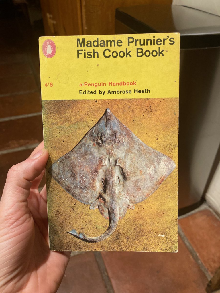
NOBODY WANTS THAT ON A BOOK ABOUT FOOD.

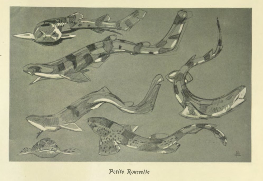
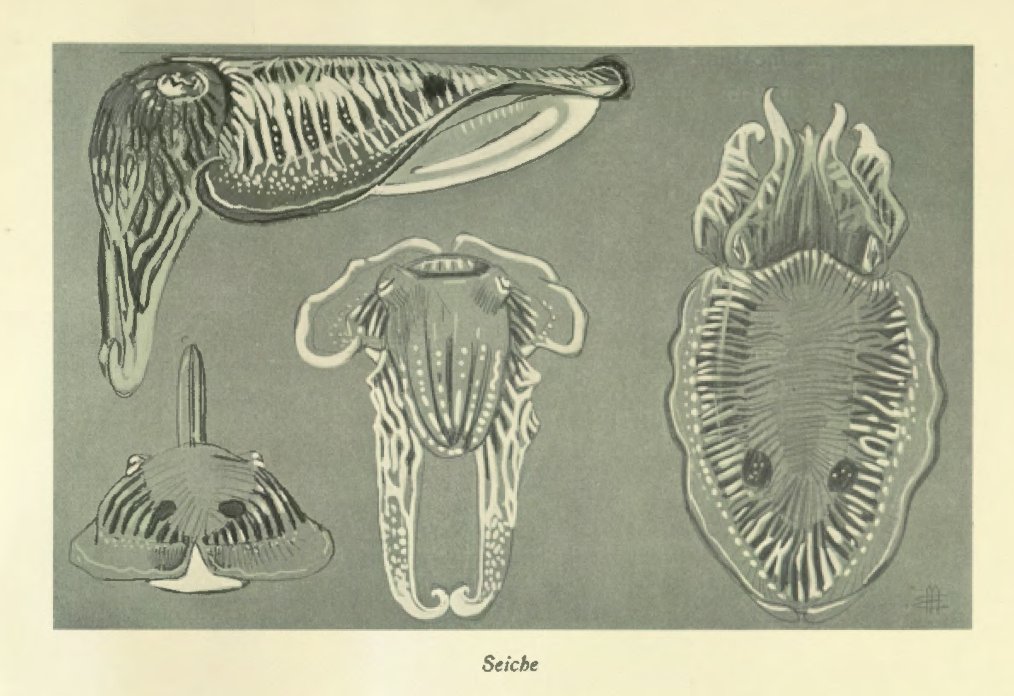
But the original text, I should mention, is from 1939. And when I cracked it open I was surprised to find that the illustrations were incredibly cool.

A photograph of a yellowed page from a book featuring delicate black and white illustrations of sea creatures.

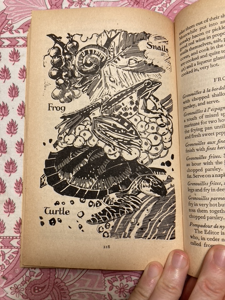
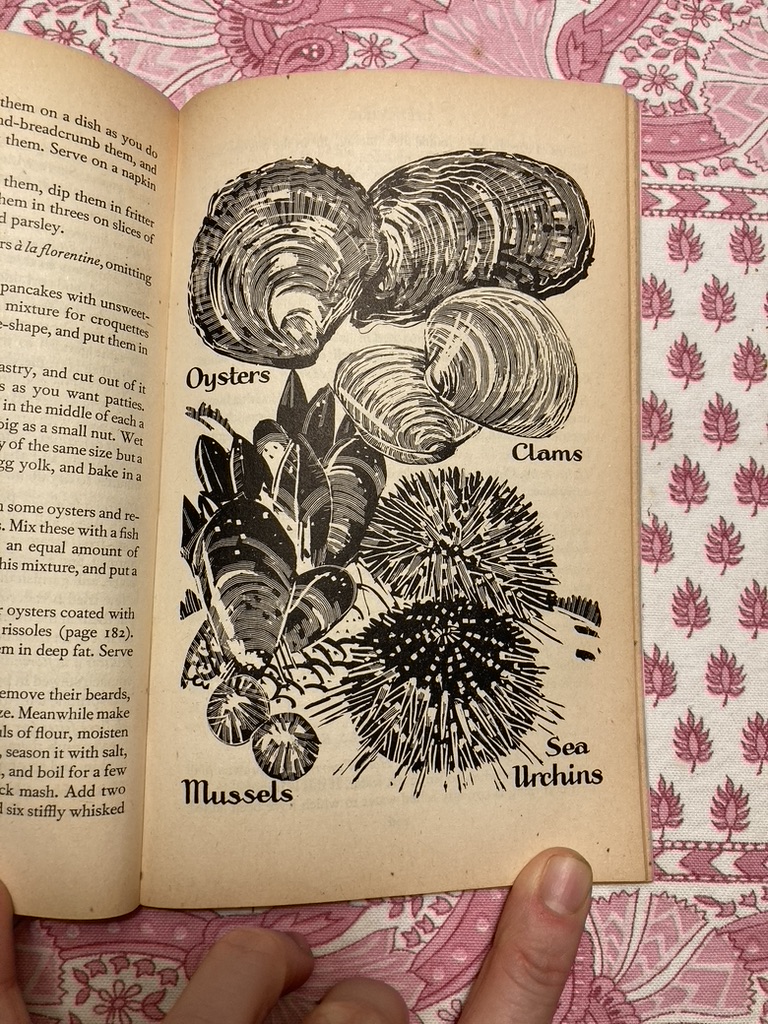
Look at those lines! So stylized! So energetic! And the compositions!

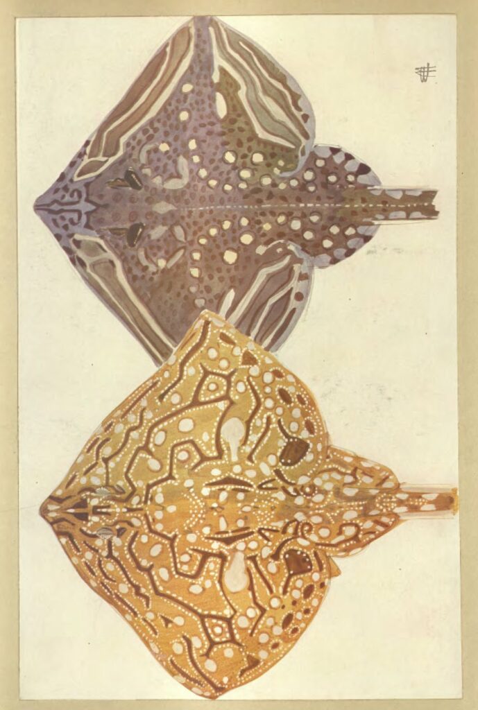
Turns out the interior artist is one Mathurin Méheut (1882-1958), a French painter I’d never heard of before. When I went searching for more of his work, I found a treasure trove. Méheut had spent two years before WWI working with naturalists at the Roscoff marine biology station—a collaboration that resulted in two enormous volumes of gorgeously-depicted marine life.

And, to my immeasurable delight, both of them are available online via RISD’s library.

Small sea grasses and weeds painted in color on a white background.
A delicate painting of kelp and seagrass rendered in color.
A gorgeously detailed illustration of several tiger sharks on toned paper.
A gorgeously detailed illustration of several cuttlefish on toned paper.
Two watercolor paintings of sting rays in yellow and purple.

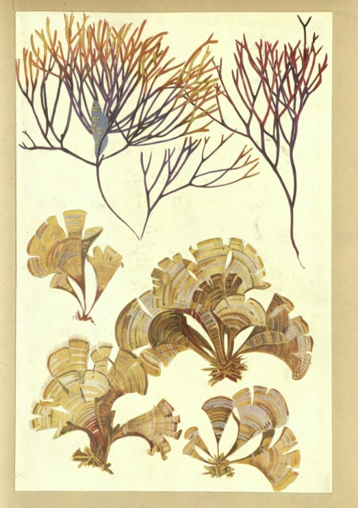
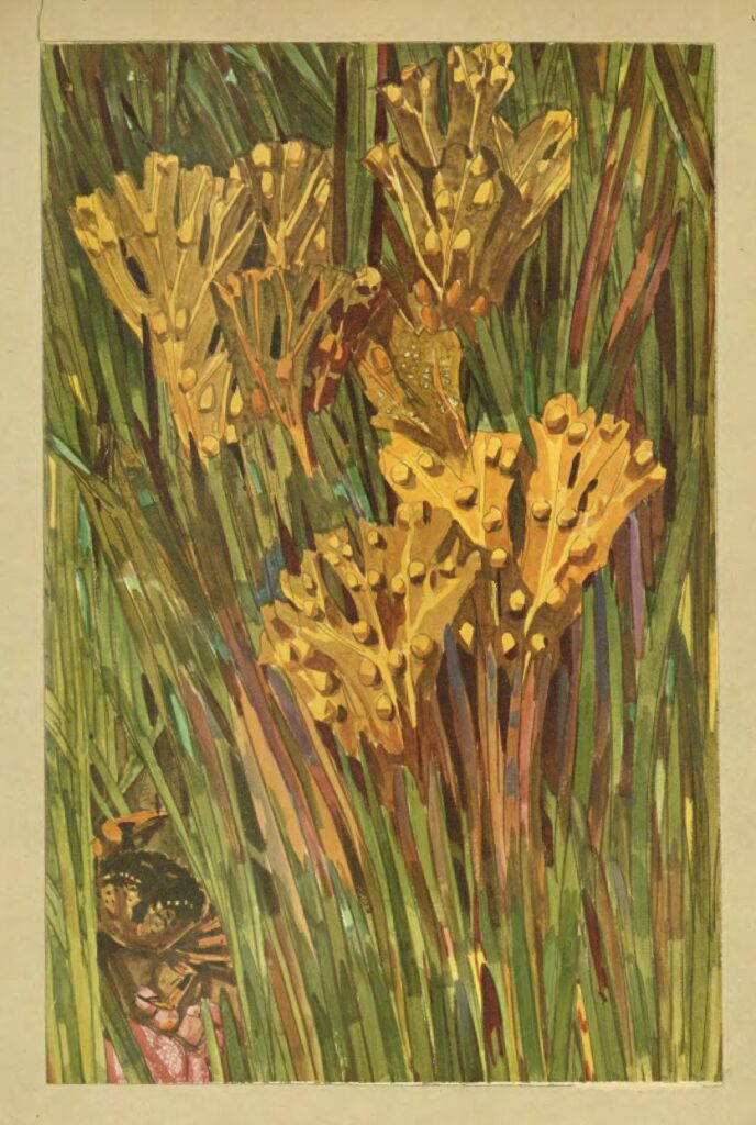
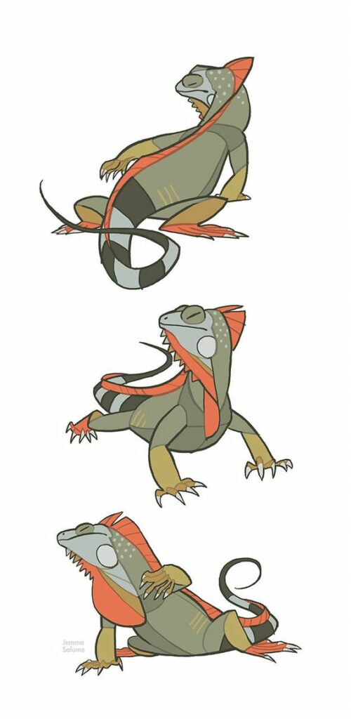
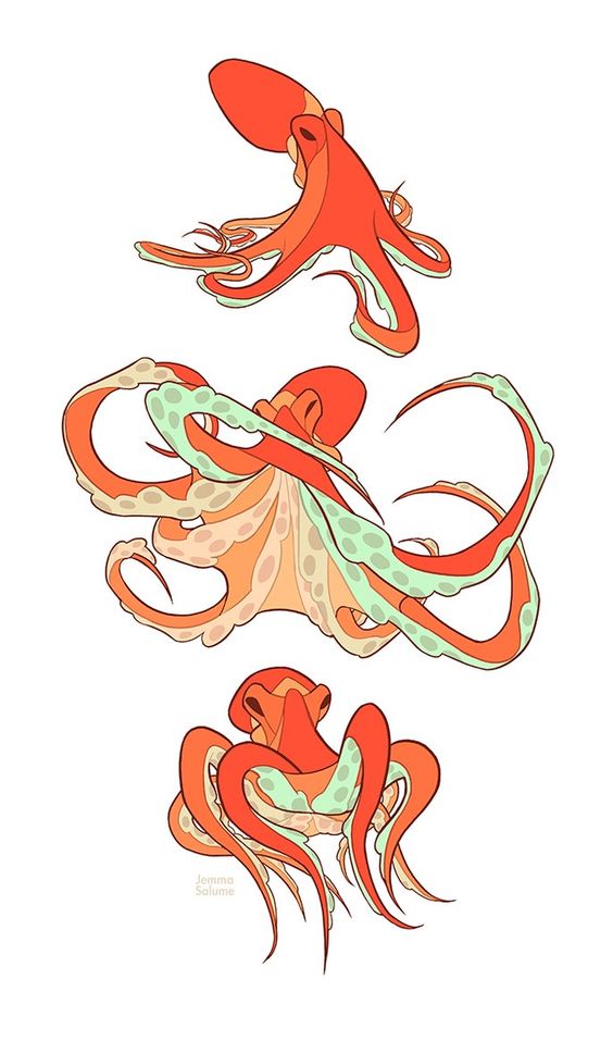
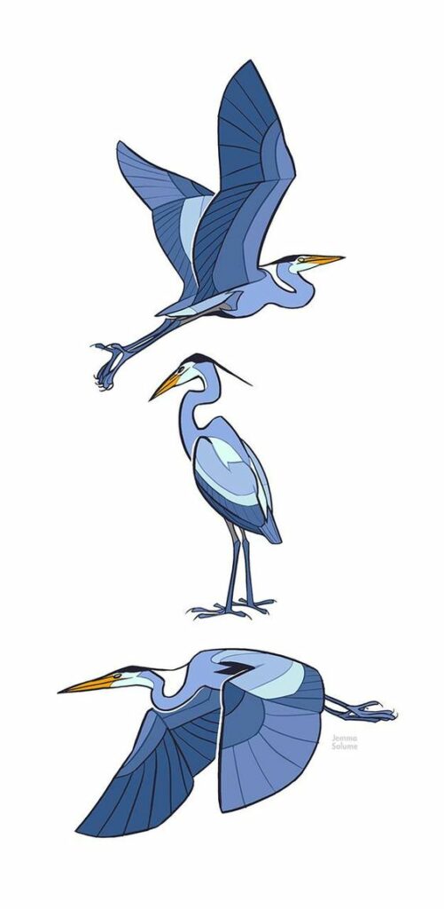
I love stumbling on illustrative work like this. It feels so modern! There’s a level of stylization that really reminds me of Jemma Salume’s animal studies.

Three illustrations of an iguana in various poses
Three illustrations of an octopus in various poses
Three illustrations of a great blue heron in various poses

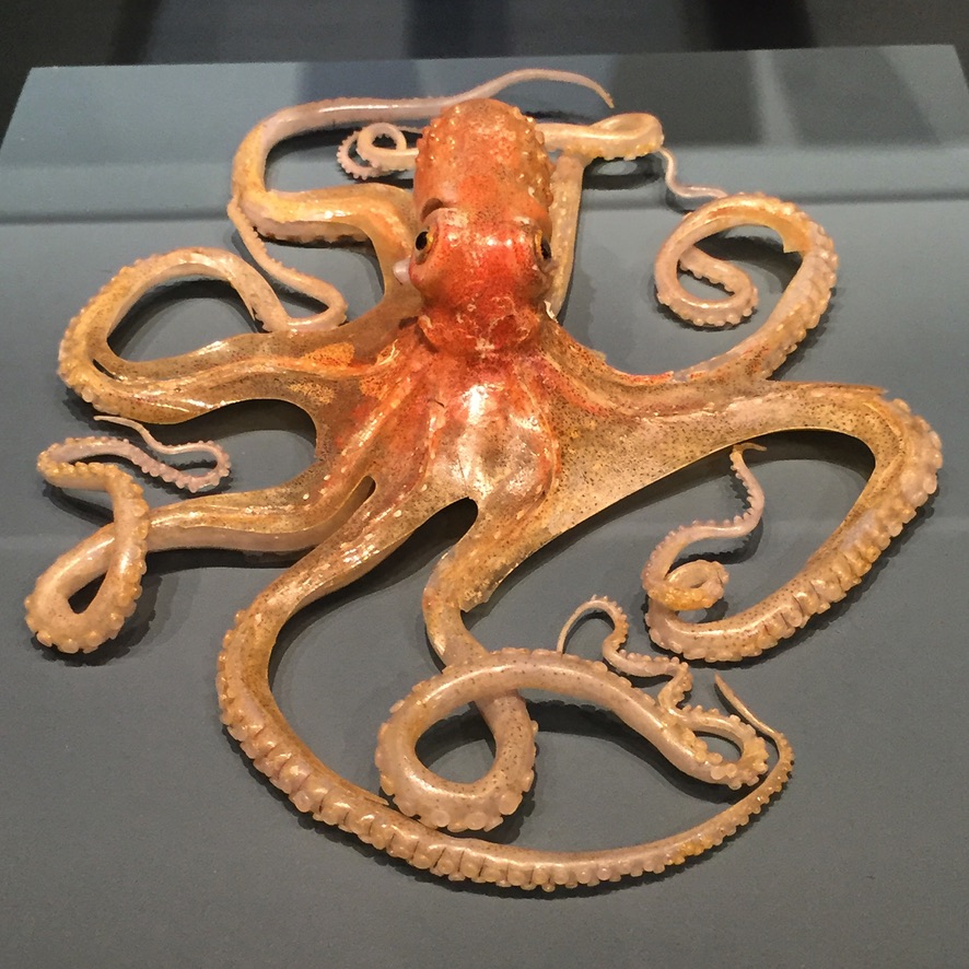
I also can’t help thinking about the work of Leopold and Rudolf Blaschka, the father-son team known for creating the most exquisite glass models in human history. Their success lay in capturing the shapes and colors of marine invertebrates at a time when methods of preservation typically left specimens looking like so much indistinguishable mucus.

This octopus? GLASS.

A detailed model of a small orange octopus crafted from glass

This cactus? ALSO GLASS.

A detailed model of a strawberry hedgehog cactus crafted from glass

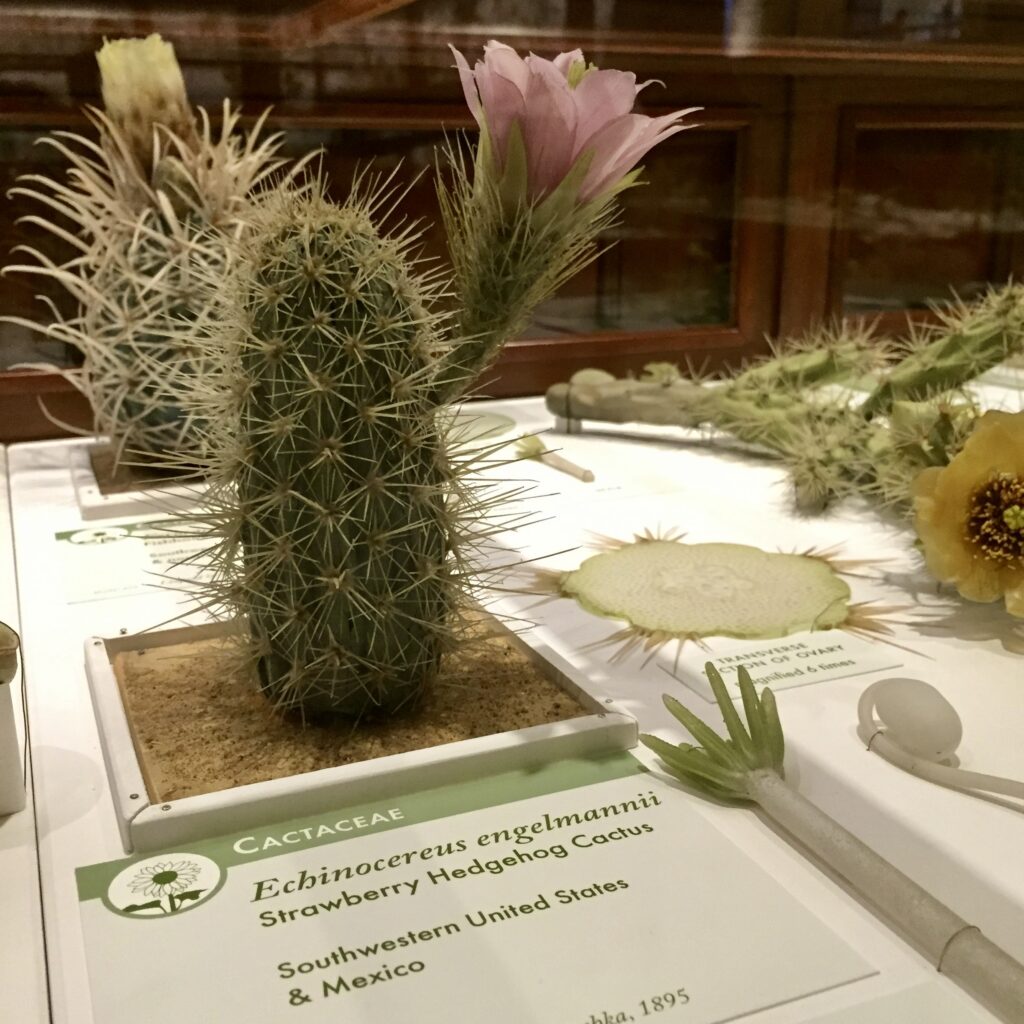
Unreal. (And well worth a visit if you ever find yourself near the Harvard Museum of Natural History.)

In the process of writing this post, I learned that Leopold fell in love with marine invertebrates in 1853, when the ship carrying him to America was becalmed for two weeks near the Azores. His wife and his father had just died within a few years of each other. The trip was something of an escape.

I think about him, adrift and grieving in the middle of the ocean, with nothing to do but stand on deck in the night and pay attention.

Hopeful, we look out over the darkness of the sea, which is as smooth as a mirror; there emerges all around in various places a flashlike bundle of light beams, as if it is surrounded by thousands of sparks, that form true bundles of fire and of other bright lighting spots, and the seemingly mirrored stars.

Little wonders all around.

A Truly Magnificent Thing

A screenshot of British and Exotic Mineralogy, a website organizing illustrations of rocks in an interactive, color-coded map.

Interactive! Illustrated! Compendium!

…OF ROCKS!

This is one of those situations where the “About the Project” page contains just as many delightful surprises as the project itself. Just a treat from start to finish.

(Reminiscent of An Ocean of Books, a project I blogged about back in November of 2020.)

Welcome, baby.

Hey look. It’s here.

A hand holding up a copy of Tell the Turning against a grassy field and sunlit trees and a blue sky. The cover of the book is simple white with a spiral of illustrated stones.

Working on Tell the Turning with Tara and Stefan over the past year has been such a gentle, eye-opening process. Historically, there’s been an element of exhaustion or overstimulation in the work I make due to it being tied in so many respects to social media. The energy of being on Twitter or Instagram bleeds into everything from the pace of production to the pressure to reach more people. Even if I’m enjoying making the art, there’s this extra stuff that I don’t quite know what to do with.

But this book felt different.

We took it at exactly the pace we wanted to. We didn’t share a great deal online as things came together. Instead, we focused on enjoying the process of building something as a team. We focused on enjoying each other. Mostly this took the form of writing many, many goofy emails, but there were other bits and pieces too.

I’m pretty sure we’ve only had one Zoom call this whole time.

When it was time to crowdfund the book, it funded. Quickly, and without much fuss. There was no need to hurtle towards stretch goals because we knew what we wanted to make and it was modest. Between us, we knew enough people who were willing to pitch in. We shared the load.

Time passed. The manuscript was typeset. I spent about a month in my new studio making paintings, settling in, texting Tara occasionally to ask about the identity of this or that plant mentioned in the book. We took a walk on the beach when she was visiting California in the summer. Stefan and his team sent the book to print.

And now all three of us have copies in our hands. In Poland, in Portland, in Ojai. And I guess a lot of other people are about to have copies in their hands as well, but a lot of this still feels local to that trinity.

Three friends who wanted to make something together, and then did.

A spread of white paperback books, all copies of Tell the Turning. There's a spiral of grey rocks on the cover, plus a few postcards scattered around. The books lie in a grassy field.

I like working this way. I hope I get to do it again sometime.

Nesting and Turning

My working theory is that the silence and the sunshine and the singing are key materials of the nest I am always building, to hold whatever thoughts, feelings, rhythms, and ideas become my poems.

Tara writes a monthly guest column on Nicole‘s blog. Every installment holds several gems, but her latest is particularly gemful. The nest! I adore this metaphor. What are my nest materials? How do I tend to build with them? I don’t know yet, but I have hunches. I want to lay them out and inventory them like a bower bird.

An additional thrill is that Tara and I will be working on something together in the next few months. She’s a spectacular poet (in addition to being a thoughtful and lyrical essayist), and sometime last year she shared a new collection of work with me under the title Low Tide Book. (You can hear me explore her idea of “a low tide of the spirit” in Ramble #20, notably before I got with the program and started pronouncing her name properly. It should be terra, like earth.)

I read the poems and loved them, and then I can’t quite remember what happened next but somehow I got to do my very favorite thing and smush two good people together while yelling “MAKE SOMETHING!”

The other person in this equation was my friend Stefan.

I say “my friend” in that way I do to refer to anyone I know primarily through the internet, and it’s true we’ve never met in person, but I do think of Stefan as a friend.

We connected on Kickstarter in 2012 because we were both running our first projects at the same time.1 He ended up with a copy of True Believer and I ended up with a copy of Cedar Toothpick and then we sort of fell out of touch. I do remember that his campaign didn’t have a video, but rather a delightful audio recording taken in a field. Possibly with some bees. Anyway, I loved his attention to quality in paper stock and his creative focus on the minutiae of the natural world. Cedar Toothpick still has pride of place in my poetry shelf.

When we reconnected via Instagram many years later, he floated the idea of collaborating on something. By that point he’d been branching out into publishing work by other writers under his imprint, Bored Wolves. Somewhere in there was when Tara sent me Low Tide Book, and somewhere shortly after that was the moment I realized they were perfect for each other. She had this manuscript full of contemplative poems crafted in conversation with the natural world, he had a tiny, remote cabin in the Polish highlands and access to a boutique printer. It writes itself, really.

So the long and the short of it is that we’re all making a book! Tara’s already written it, and I’m going to illustrate it, and Stefan’s going to publish it.

The title we decided on was Tell the Turning and it’s (as of May 1st) ON KICKSTARTER RIGHT NOW!

1. The ecosystem was much smaller then, so it was common to just become pals with whoever else showed up in the Discover tab. It was nice.

A Life in Objects: PDF & Print Edition

Cover

As you may’ve noticed, I’ve spent the last three(ish) months working on The 100 Day Project, a creative game of sorts where participants try to create something every day for 100 days. I chose to illustrate meaningful objects from my life with little vignettes of text.

The final collection, A Life in Objects, is now up for sale! I’m printing a facsimile edition in three, 40-page pocket notebooks—the same size as the originals (3.5×5″)—with a fancy belly band.

100DayConceptNoCase

The books will be printed locally in Portland at Eberhardt Press, and I’m hoping to debut them at SPX in September.

If you absolutely can’t wait to read the whole thing, why not buy the PDF edition on Gumroad? I promise it’s got all the same treats inside.

PreviewAll

I’m incredibly proud of how this collection came out. More news to come once the printed books are on their way!

Light in the Eyes

Sam_For-Animation-Slower

Something a little different today: a process GIF from a recent illustration commission! This cat portrait was done start-to-finish in Manga Studio with Frenden’s blue pencil and Hairpin Sable inker brushes.

You notice how the cat really comes alive in that last frame when the white highlights in the eyes come into play? Every time I add those to a piece I get this really vivid memory of going to art classes as a kid.

My teacher’s name was Sharon Butler. She was a realist painter from South Africa who painted waist-high stones to look like living cheetahs, crouching in the greenery outside the studio. The two rooms in her establishment were filled with the perpetual, chalky scent of pastels and Prismacolor pencils. We’d get pieces of illustration board handed out every time a new project began, cut down to the appropriate size. I completely lost track of time every session I spent there. My only job was drawing, as well as I could.

This was pre-internet, so Sharon kept a morgue file in the inner room. It was a metal filing cabinet—dull beige and taller than I was at the time—crammed full of photos and magazine clippings. There were folders for horses and dolphins and birds and architecture and chairs and people and costumes. Every manilla folder had a grouping by subject, and since Google simply wasn’t around yet we’d fight over who got the best picture of the dolphin to draw from.

I drew a lot of animals when I went to those classes with Sharon. She’d stop by while I was struggling to render a hummingbird as something other than a crude cartoon, giving suggestions on how I could better train my eye to see what was actually in front of me. The second-to-last touch, before the fixative stopped our pastel smudges from scattering off the page, was to add a dot of white in each eye. She taught us to use a Q-Tip or the back end of a paintbrush.

At the time it felt like wizardry—the amount of life that tiny dot of white could bring to an otherwise flat animal.

It still does, kind of.

New Merch: “Fair Winds” & “Blissful Indifference” Postcards

I’m releasing two new postcard designs this week!

PostcardsHeader

They’ll be coming in sets of 5 for $5—a mere buck-a-postcard—so hop over to my store to pre-order, or read on to learn more.

Many moons ago I drew this in a sketchbook to celebrate the passage of time and its marvelous effect on giving a shit about things.

GiveaShit
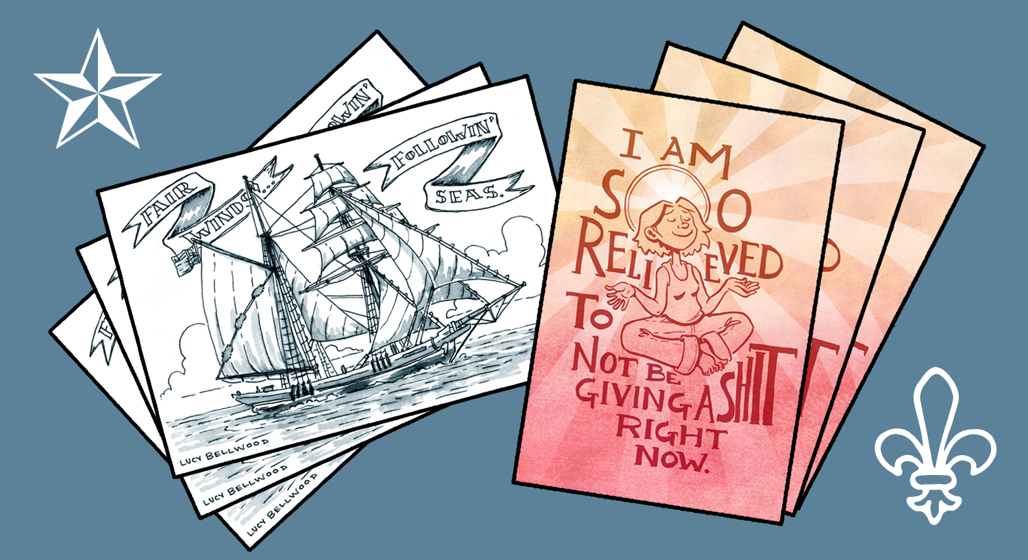
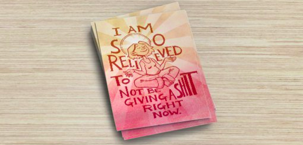
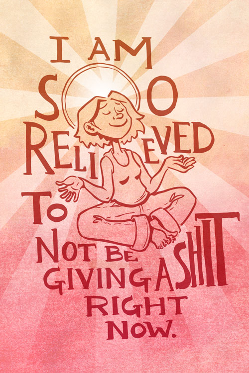
Who among us has not encountered a previously fraught circumstance, only to find that the anxiety, stress, and strain surrounding it has completely dissipated? What a relief. So I’m printing up a batch of glossy, UV-coated 4×6″ postcards to celebrate the sensation. Preorder a set here to ensure you’re in the first wave.

Screen Shot 2016-02-23 at 2.04.20 PM
Postcard mockup!

For the more nautically-minded among you, I’ve whipped up this illustration of the brigantine Irving Johnson of the Los Angeles Maritime Institute, sailing away with a classic sailors’ valedictory phrase. Send it to far-flung friends or keep it for yourself as a reminder that calmer times are ahead.

FairWindsPrint

Both cards feature space for an address, stamp, and message on the back, like so:

BackCardMinimal

Tres chic! Check out the whole selection of postcard offerings here. Enjoy!

The Ornithology of the American Lesbian

If you follow me elsewhere on the Internet you’ve probably already seen that I illustrated this feature for BuzzFeed on The Ornithology of the American Lesbian. The writers gave me a ton of freedom when it came to matching birds and humans, so I got to run wild picking my favorite avian friends. Challenges included accurately translating Bette Porter into an ostrich and Lea DeLaria into an owl.

My only enduring sorrow is the fact that the authors were originally thinking of human illustrations, so the classification text never got updated from Mammalia to Aves. Apologies in advance to my scientist pals—I promise I’m only responsible for the artwork. Check out the whole list here!

Linework NW This Sunday

tumblr_static_16w0pjwdaocg4ccw4w80g0w88

Hey Portland! I’m making a hometown appearance at Linework NW this weekend. This fantastic indie comics and illustration festival boasts a unique format with two completely different sets of exhibitors Saturday and Sunday. This means you can only find me there on Sunday (at Table 24B), but should totally show up both days to take full advantage of the talent on offer. Did I mention it’s stone cold free to attend? You heard it here first. Or maybe you didn’t. Either way I’d love to see you on the floor.

The skinny:

Linework NW – 4/18/2015 + 4/19/2015

Location: Norse Hall111 NE 11th Ave, Portland, OR 97232

Date: Saturday, April 18, 2015 & Sunday, April 19, 2015

Time: 12:00pm – 8:00pm

And here’s a handy map! See Table 24B? Right in the middle there. Aw yeah.

MAP-WEB-SUNDAY-2000

You can check out the exhibitor lineups for both days of Linework NW right here. I’ll also be speaking on a panel called The Modern Reality of Fundraising for Artists at 4:30pm on Sunday with Hazel Newlevant, Kory Bing, and Taneka Stotts, moderated by Tristan Tarwater. Check out the full listing of panels for more exciting discussion topics.

Hope to see you there!